Light Harvest
The invisible process of photosynthesis becomes tangible in this oversized interactive sculpture.
Light Harvest
The invisible process of photosynthesis becomes tangible in this oversized interactive sculpture.
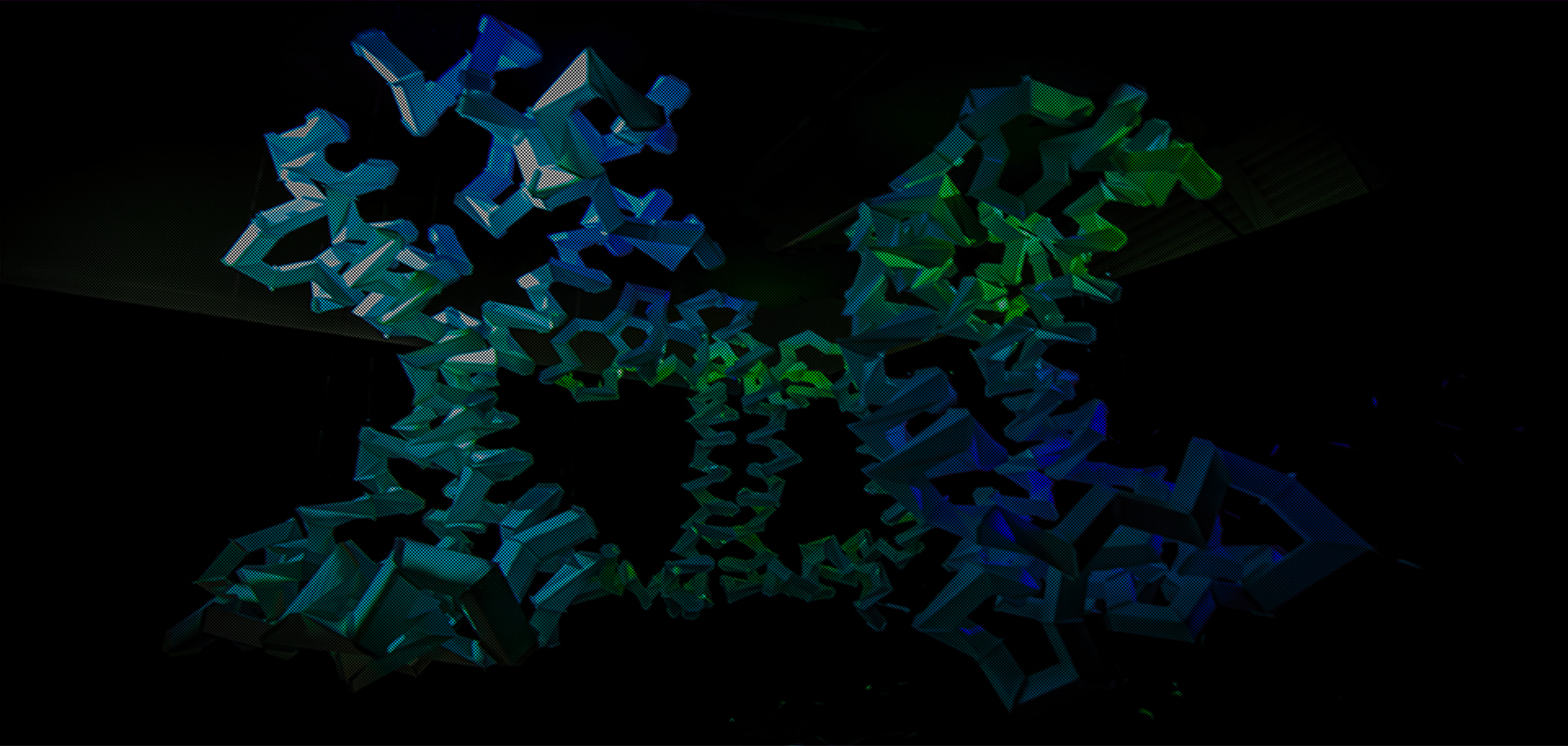
Light Harvest premiered at Indiana University’s annual (Re)Imagining Science exhibition, which aims to inspire scientists, artists, and the public on the aesthetic beauty contained in the latest research. The tri-fold symmetry found by X-ray crystallography of the protein LHC-II inspired the artist to create a geometric representation out of paper. It was important to show a meaningful correlation of the protein’s internal chemical bonds and its emergent form, with an impressive visualization of how energy transverses the structure.
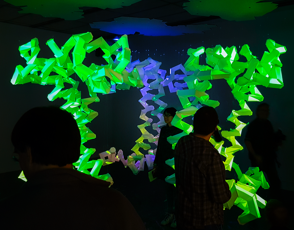
The protein LHC-II stimulates electron transfer in chlorophyll - figuratively harvesting light for energy production in plants (and some animals). We wanted visitors to intuit this relationship of energy transfer and become active participants in its process. However, because the artist’s medium of choice is white translucent Koji paper; the interactions needed to be hands-off, to not damage or dirty the structure.
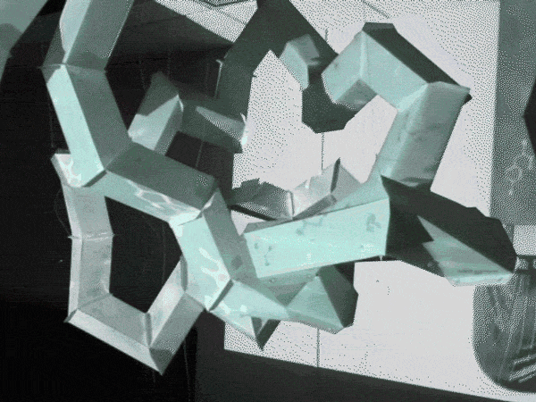
The complex weaving comprising the protein’s backbone is geometrically constrained by its amino-acid chemical bonds. We needed to derive an algorithm that accurately converted each twist and turn in three-dimensional space to an unfolded panel, for precision laser cutting. Additionally, the structure needed to “sense” external activity and visually convey that information across its three chains.
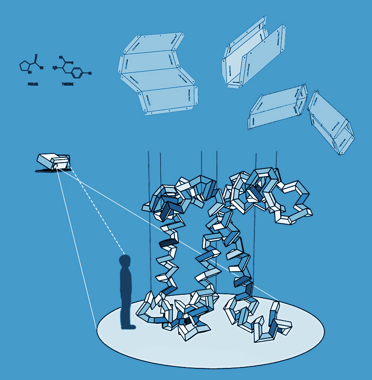
Depending on your viewing distance, the structure has three different interpretations: from afar, visitors see the protein’s symmetry and distinctive geometry; closer, their presence triggers glowing rainbows of color (in proportion to scientifically accurate color absorption rates); finally, each panel is laser cut with the chemical symbols and names for the amino acid pair bond it represents.
We had long debate over the most appropriate colors to use to define the structure. Chlorophyll absorbs red and blue light, reflecting, and thus, making leaves appear green. A shade of green, then seemed to be the most accessible color choice for the public to understand the structure; however, the artist was strongly against having a glowing green form in its resting state, and we compromised on green representing high amounts of activity to fit within the chlorophyll mental model of visitors.
To invite visitors to explore the structure, we triggered segments of the chain to animate and change color in relation to their location and proximity. The closer they would stand next to the structure, the more dramatic the activity - as though the structure was feeding off of their energy. If they stepped too close, however, their cast shadow would naturally block the projected light, encouraging them to stay within a safe viewing distance of the form.
Using bodystorming and “Wizard of Oz” methodology, We invited users to test the structure in various levels of completeness to refine the trigger zones and visual indicators. We found that when multiple people interacted with the structure at once, they needed a way to distinguish the effects of their proximity from someone else's. We divided the exhibit into 75 zones of influence. Those zones closest to the structure would have the highest excitation rates local to that zone and globally to the structure.
Using a combination of Rhino and Grasshopper (a 3D modeling and node-based programming language), I created joining rectangular prisms to follow the protein backbone as a guide chain. I then scripted a macro to unfold the prisms into flat geometry and scribe the fold and cut lines, and appropriate labels. The forms were then laser cut, hand folded, glued, and secured with fishing line (663 in total).
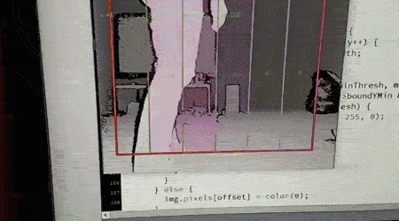
For the interaction and visualization, three Microsoft Kinect sensors, high lumen short throw projectors, and desktops were placed ceiling height surrounding the structure. I wrote a Java program that would detect user movement in 75 different zones in the exhibit and feed the data into an algorithm that controlled the color, speed, and brightness of a masked gradient projected onto the structure.
Writing the general form algorithm can take just as long as making adjustments manually. The general form is great for when changes need to be made later, but be practical about making manual adjustments: I spent nearly a day formatting code so that the acid labels would all orient parallel to their fold seam; I could have spent half the time rotating each label manually.